I. Everybody knows Mario games

The first error that I made with this level is apparently very common among Junior Designers; I tried to give my personal take on an existing IP.

The idea behind it is surely noble, it is something like “I want to show that I can do something interesting without copying others“.

It sounds very cool and I was very satisfied when I played my version of Super Mario World. It was very different and quite interesting; this is what I thought at the beginning, at least.

Then, other people started to play it and the brilliant idea started to fall apart. This was a very good lesson, it really helped me to understand how consistence is important.

In this case, where I had to design contents for an existing title which a long traditions, I should have been way more careful with introducing new elements in game.

Following the breakdown, you will read some examples of what I mean, but the takeaway is very simple: if you can’t properly explain a different behavior, don’t change it.

II. Level design breakdown

This was a timid attempt to tutorialize the gaps in the level showing the difference between the first, harmless one and the second, filled with lethal carnivore plants.

I don’t think it worked very well: the shape of the two pits is too different and there is additional geometry above the second one. This defeat the purpose of this design, because players are not able relate these two environments.

I kind of did what I was supposed to do at the third step: adding a twist to the mechanic that I wanted to teach. To be honest, nobody felt inside of the second pit, probability because every playtester already played Mario games.
 

Teaching mechanics

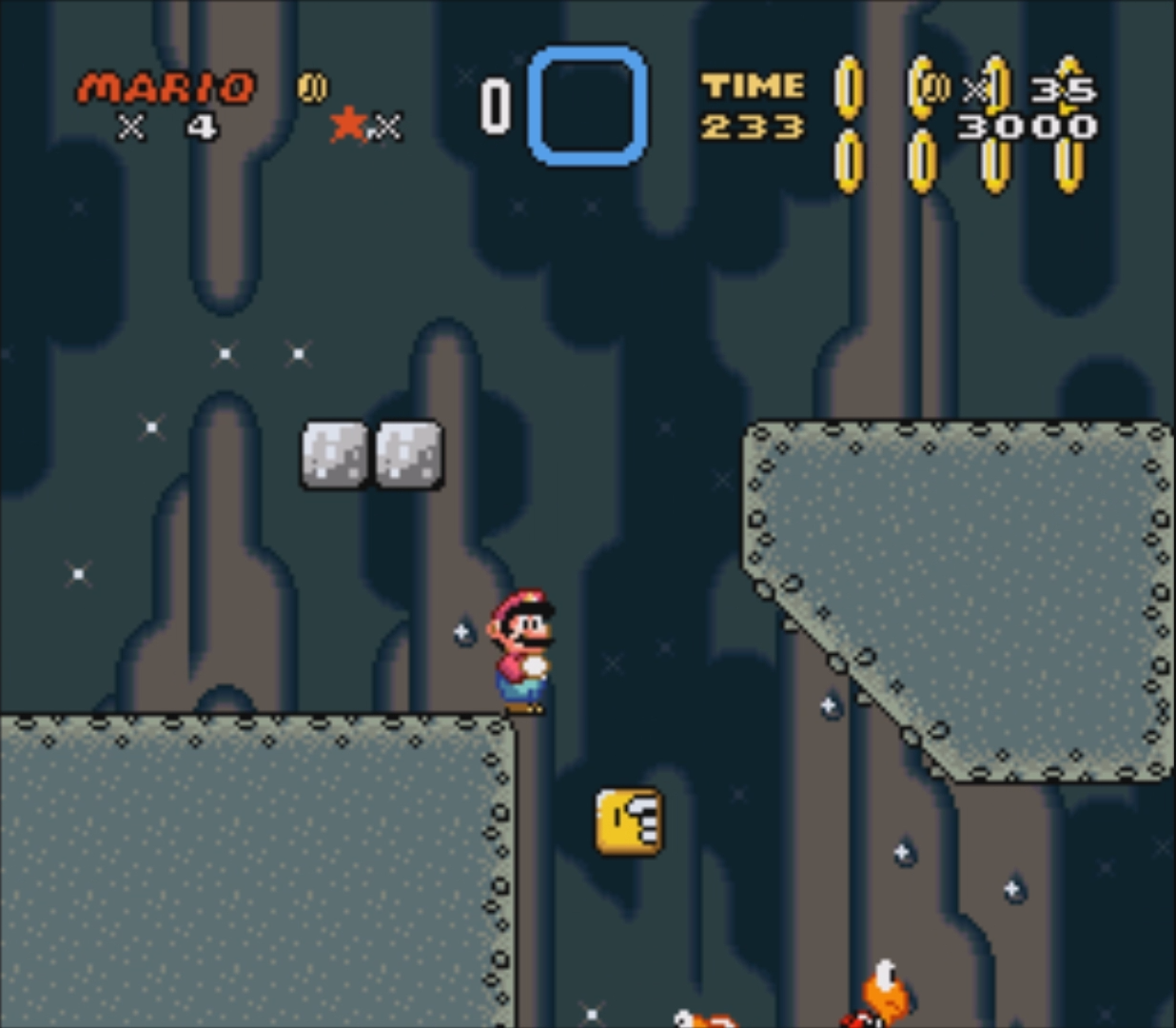
Here I tried to push a bit how Super Mario World works: I wanted the player to stop and thinking a bit, but in SMW games players are not use to jump without seeing where they are going to end up.

The yellow cube has the purpose to provide a spot from where players can have a better prospective, which is something that worked during playtests, but as far as I know it is something new to SMW titles. It would be interesting to test it with people that never player Mario games.

Another small issue of this section is related to metrics, because there is not enough space to safely jump between the yellow block and the green cliff on its right. It is even more risky because during the jump it is impossible to see the movements of the enemies at the bottom of the pit. Following, a very interesting video that shows the four-steps-concept that I was talking about.

Pushing to explore

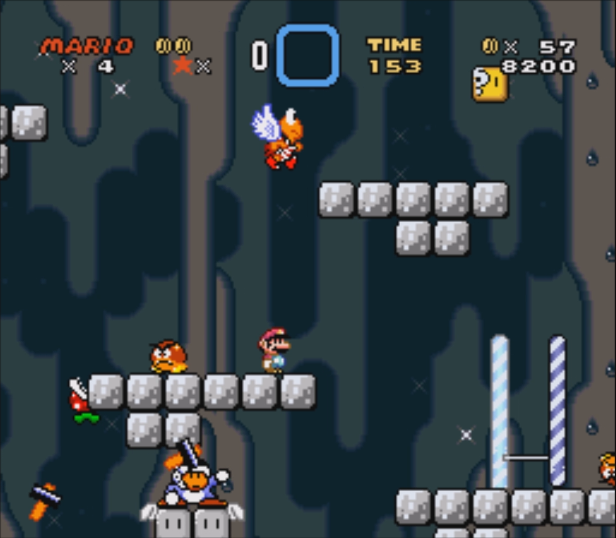
In this screen is possible to see at least a couple of design issues:

– the first one is related to the number of different enemies on screen. Usually, Mario games show just two of them at the same time enemies, because having more looks chaotic and doesn’t really improve the difficulty in a good way. This happens because the focus shifts from the typical jumping/puzzling mechanic, to avoid enemies with different patterns.

– there is a carnivore plant going through the geometry, because I didn’t used the asset as it was intended to. I think that it is very important to reuse assets in different ways, It could save a lot of time, because artists are not forced to produce extra contents. However, it is important to be sure that the behavior of the manipulated asset fits with the environment and doesn’t looks glitchy like in this case.

Respect roles

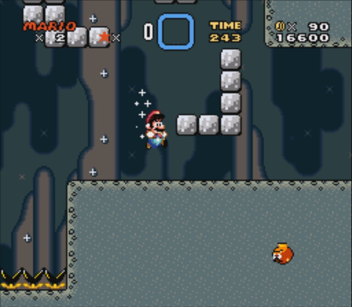
The screenshot on the right is not very clear, but the video is, so if you are curious, just check it out, the issue is shown at ~2.40.

In Mario, sometimes we have invisible blocks that have a different behavior depending on the direction that the player is moving towards. Moving from the top to the bottom doesn’t trigger any collision, but doing the opposite triggers the collision and the player gets also a visual feedback, because a brown block pops in where the invisible one used to be.

It happens the same also in my level, but with an important difference: the brown block doesn’t appear. This doesn’t change how the system works, but not having visual feedback leaves always a weird feeling, because players start to question if everything is working as intended or not. I think that often it doesn’t even matter what happens, players are fully satisfied by the experience as long as there is a understandable reason behind it. 

Always provide feedback

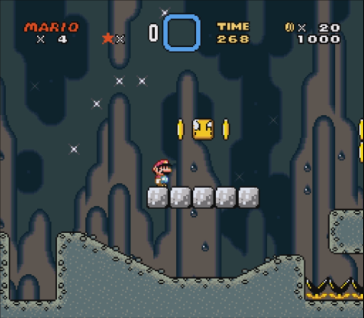
Surprisingly I am not going to say anything negative about the design on this screenshot as I usually do, because I think that pointing out issues is way more productive and interesting than showing “perfect” design. During my experience at VFS I quickly learnt than failures are not a shame, but a precious learning experience.

I like three things about this screenshot:

– Mass and void are something a bit unusual for Mario games, but I don’t think that I didn’t go too crazy with the design.

– The player has always a clear idea of where he is going to end up after a jump, because he can always see the platforms around.

– The coins provide a small reward, but most importantly make the player curious to know what he is going to find at the bottom of pit.

Challenge and rewards